The Bricon

Our  logo features our Bricon adjacent to our company name. Combining the graphic and text elements reinforces the illuminating power of the BCG and BrightHouse collaboration.

Primary logo

This is the preferred version of our main logo. Treat it 
with love! Placing it over different color backgrounds is acceptable as long as there is enough contrast to clearly distinguish the logo. Please ensure all its elements 
are legible.

Stacked logo

If space is constricted please use the stacked logo to ensure there’s room for both the Bricon and text.

Outline logo

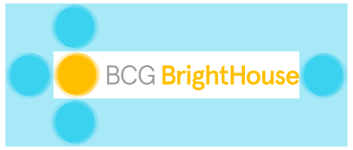
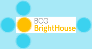
Use this outline logo when our layered logo will not work. It should be applied when placing our mark on printed materials like fabric, metal, and leather. Also, use it in situations where our logo needs to be simplified to match the style of a client or partner on a project. Please ensure the mark appears large enough to be read “BCG BrightHouse” and you can see the spaces between the overlapping rings of the Bricon. Using the logo over different color backgrounds is acceptable, as long as there is enough contrast to clearly distinguish the logo.

Safe margins

The safe margins around the logo are proportional to the size of the bricon. Please ensure there’s enough clear space around the logo for legibility.

Only use this version when color usage is not allowed.

Minimum size

Our logo is designed to scale to small sizes in print 
and digital.

Please ensure the minimum size for the logo height in print is 1.3 cm / 0.5 in / 37px (72dpi) / 154px (300dpi).

If the logo height is smaller than stated above, we provide a reduced scale version.

The minimum size for the reduced logo height in digital is 0.9 cm / 0.35 in / 26 px (72dpi) / 106 px (300dpi).

Guidelines

01

Don’t use our logo without the bricon.

02

Don’t stretch or manipulate our logo.

03

Don’t apply drop shadows or gradients 
to our logo.

Fixed background

If design constraints, photo transparency, or background color hinder the primary logo’s visibility, opt for the logo version with a solid white or black background based on contrast needs.

Bricon

The Bricon is the symbol of our brand. It represents the sun while reinforcing our purpose to illuminate and reveal true light in the world. The overlapping layers speaks to our dynamic ability to bring insights and creative energy to our clients.

Background control

Using our Bricon over different color backgrounds is acceptable as long as there is enough contrast to clearly distinguish the logo. Please ensure maximum legibility for the Bricon and its outer transparent rings.
White version

Only use this Bricon version when 
color usage is not allowed.

Bricon Insets

This framing elevates and draws attention to an image by giving it a uniquely BrightHouse radiance and focus. Please limit one Bricon inset per slide or page.

Guidelines

01

Do not place any type on our bricon, including “BH”.

02

Do not stretch or manipulate the bricon.

03

Follow our margin guidelines (below).

Safe margins

The safe margins around the bricon are equal to the logo width (X) divided by three. Please ensure there’s enough clear space around the bricon for legibility.

Minimum size

This framing elevates and draws attention to an image by giving it a uniquely BrightHouse radiance and focus. Please limit one Bricon inset per slide or page.

1,3 cm

0,5 in 

37px (72 dpi)

154px (300 dpi)
0,9 cm

0,35 in

26px (72 dpi)

106px (300 dpi)

Visual devices

We use a combination of soft curves and hard corners in our visuals to show we’re fluid and structured, imaginative and practical. For design consistency, we only use perfect circles and right angles as shapes.