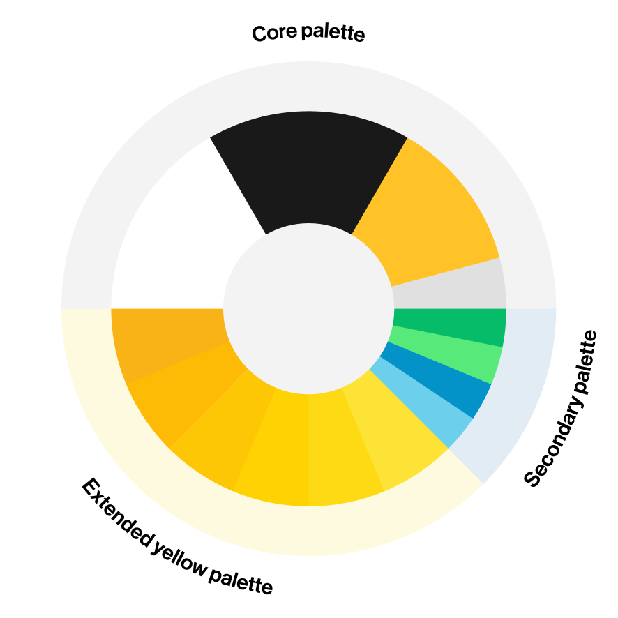
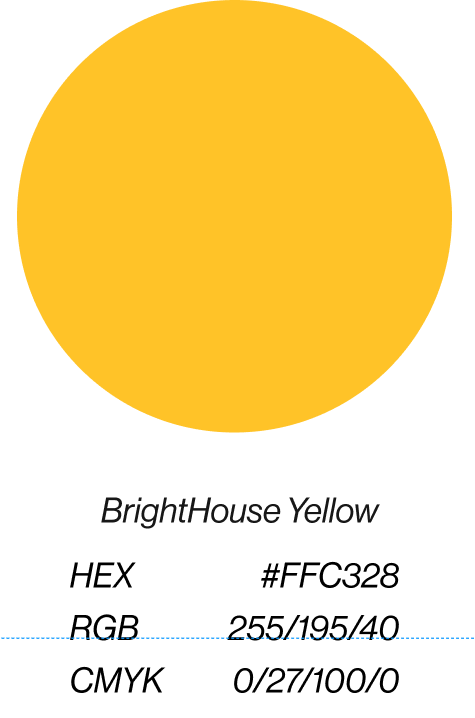
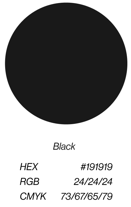
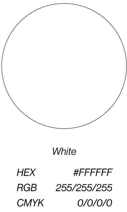
The main hero of our BrightHouse core palette is Core Yellow, the visual embodiment of our purpose to Discover True Light in the World. Our Core Yellow evokes boldness, warmth and humanity, while the use of our Core Black and White brings a sense of sophistication to our brand.
Our extended yellow palette builds upon our classic Core Yellow, and provides gradual emphasis, hierarchy, and depth, and our secondary palette colors should be used to provide emphasis and/or a pop of color.
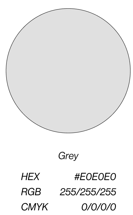
Our core palette is composed of yellow, black, and white. Our signature yellow is the pop of color that represents our brightness and brings light to our brand. We also use black and white to provide a sense of balance and sophistication.
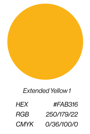
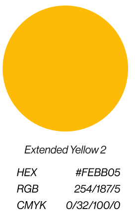
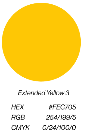
Extended
Yellow Palette
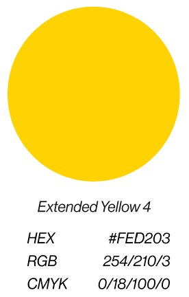
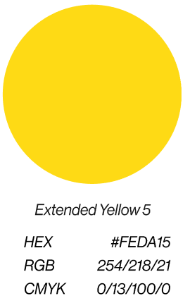
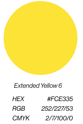
We have built upon our unique yellow with an extended palette. These shade variants are used only with our signature yellow to express gradual intensity and hierarchy of information. They also help create depth and dimension.
Secondary
palette
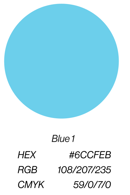
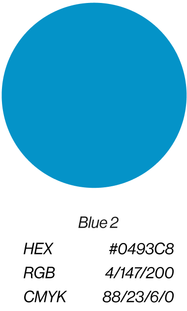
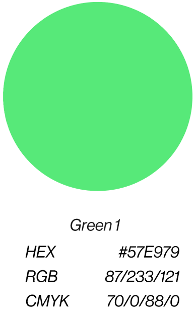
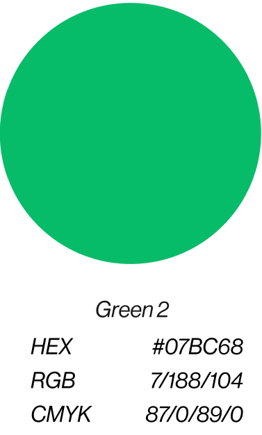
To add variety and emphasis, our secondary palette uses blue and green hues from the planet we’re serving to complement the optimism of our signature yellow. This secondary palette should be used sparingly, and only when combined with the core palette.
The history of
yellow
BrightHouse’s founder loved how yellow speaks to the power of purpose, people, and positivity. Science says that yellow delivers confidence, elevates creativity, and lifts spirits with its warmth. We’ve been using the color for almost 30 years, and we’ll continue to use it to bring our glowing BrightHouse feeling to the world.
Color guidelines
Do
01
Do use our yellow, black, and white as font colors on any background unless the situation demands a different color. Be sure to do an accessibility test to ensure legibility.
02
Do use only our core palette when designing full bleed backgrounds on slides, printed materials, or email templates.
Don't
01
Don’t use white text below 16 point size on yellow backgrounds of any shade.
02
Don’t create gradients with any of our colors.
03
Don’t use extended yellow palette or secondary palette shades as font colors.
04
Don’t allow our core palette to be outshined by extended yellow palette or secondary palette colors.
05
Don’t use any color outside of these palettes for BCG BrightHouse branded materials.