Whether we organize, strategize, scribble, or sketch,
We’re thinkers who make minds stretch.
Long form, short form, grid form, free form,
Our words are clear, concise, and warm.
In living color and in black and white,
When it comes to story, we get it right.
We find phenomenal in the familiar, bathe it in light,
So let’s keep inspiring when we write.,
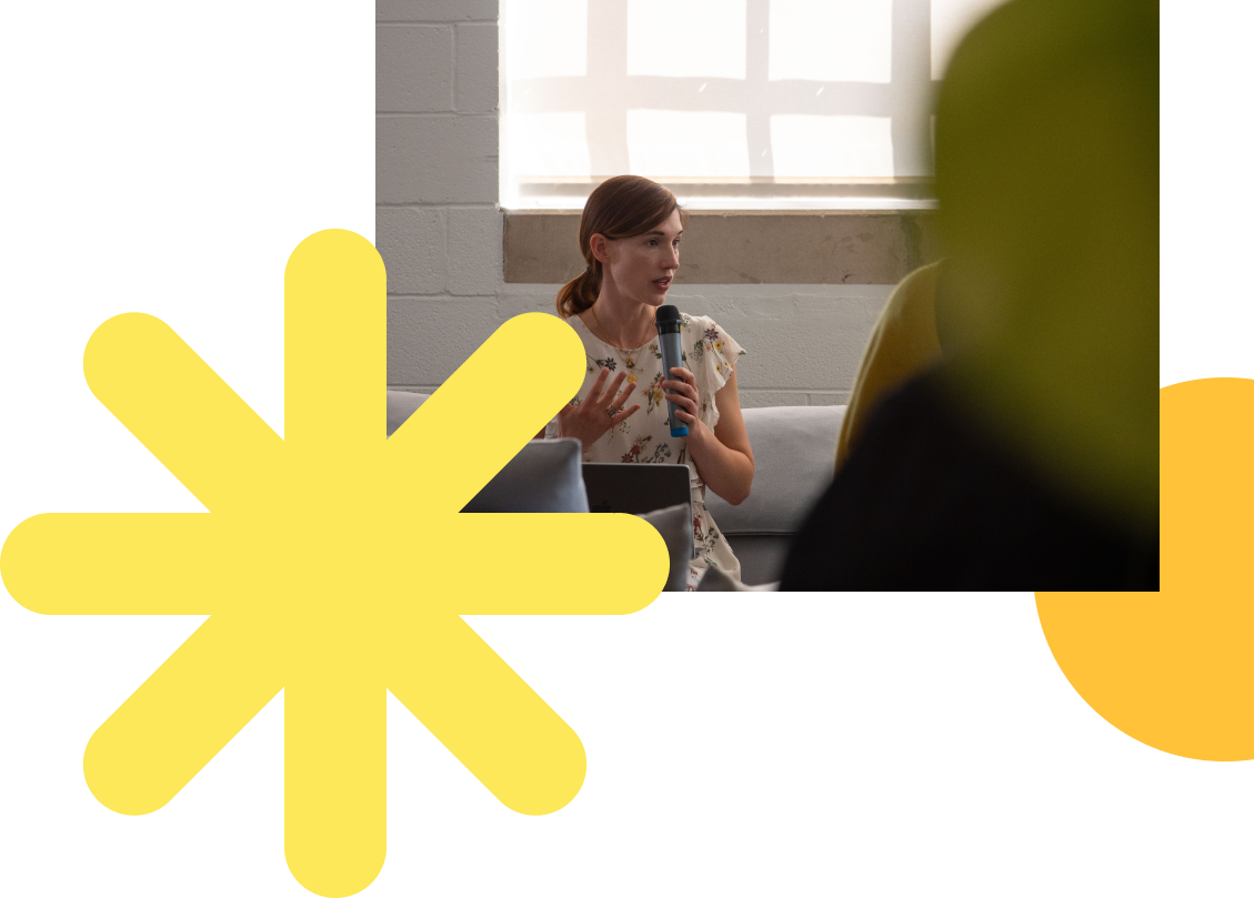
Too often, organizations focus on strategic planning and delivery. Though critical, the story can’t be ignored. Stories are the antidote to small talk and the catalysts of great movements. They’re how we bridge the distance between souls and transcend the millennia between civilizations. They form our lives, shape our species, and bring meaning to existence. Sure, an argument can make a sale, but nothing has the staying power of a good story.
Shoot the Moon article
Aug 2023
First, we dive deep. we excavate, gathering input through rigorous research, destiny sessions, and interviews from the top floor to the shop floor. By the end of the process, we know you better than you know yourself.
BCG BrightHouse pitch deck
2022
Through impactful concepts and compelling stories, we harness the power of creativity to inspire stakeholders and enable them to act. Because emotions are the strongest engine of human beings, we prioritize talking to the heart and to the guts.
BCG BrightHouse Paris pitch deck
2022

Headlines
“Idea” headlines are the idea behind or substance of the content they head, and they should be sentence case. (E.g. “We are thinkers, dreamers;” “Let’s light the way, together.”) These are most often slide titles. Refer to AP Style for title case rules.
“Label” headlines are the name of the content they head, and they should be title case. (E.g. “Global Leaders;” “Luminary Insight.”)
Our Purpose Line Treatment
Discover True Light in the World
Our purpose should be written in title case, un-italicized, with no period (unless it’s embedded in a sentence). Avoid altering the verb e.g. “Discovering,” “Discovered,” etc. We also recommend presenting all client purpose lines and principle titles in title case.
Always Caps Word Bank*
· Luminary
· Luminary Fellow
· North Star
*We no longer capitalize purpose, mission, vision, values, thinkers, ideation, or pretty much anything we used to.
Use Active Voice
Active voice is when the subject does the action. It’s almost always the stronger sentence construction. (E.g., “Emily proofed the deck,” not “The deck was proofed by Emily.”)
Avoid Ampersands
Don’t use them unless they’re in a name or title (e.g. Proctor & Gamble, President & CEO, R&D). When you need to be economical, such as in a Gantt chart, use a plus (+) sign.
Avoid Widows and Broken Words
A widow is when there’s only one word on a line. A word is broken when it’s plit between lines, resulting in hyphenation. Neither look good, and they confuse the reader’s flow.
Hyphens, En Dashes, and Em Dashes
Use a hyphen (-) to join words (e.g. all-in-one, self-esteem). Prefixes, suffixes, and compound modifiers are the most common use cases. A compound modifier is when words are combined to function as a single adjective and most often come before their noun. (E.g. “She is a well-known author,” vs. “As an author, she is well known.”)
Use an en dash (–) when representing a range of numbers or time or connecting two things to show a relationship (e.g. 3–4 p.m., March–May, the London–Paris flight). On a Mac, type option+[dash].
Use an em dash (—) with spaces surrounding to set off a phrase or clause that provides additional information. (E.g. “Emily wrote a masterpiece — as she always does — within the hour.”) On a Mac, type option+shift+[dash].
On Abbreviations
Only use an acronym on first occurrence when you are 100% sure that 100% of your audience will know with 100% confidence what it is (e.g., BCG, AI). Otherwise, provide the full phrase on first occurrence and include its acronym in parenthesis to use for subsequent occurrences. However, if a generic term would be as clear in subsequent occurrences (e.g., the firm, the system, the policy), use that, instead. In general, omit periods from all-caps abbreviations (e.g. NASA, UNICEF), but include in lowercase abbreviations (e.g., e.g., a.m.). When in doubt, ask ChatGPT for the AP Style rule.
Numbers
Spell out numbers one through nine (unless you really need the clarity of a digit, such as in an SOW). Use numerals for 10 and higher.

Alignment
All copy should be left aligned
Line spacing (leading)
Line spacing varies depending on whether it’s applied to a headline, subheadline or body copy -see below for further information
Paragraph spacing
Use wither whole- or half-line spacing for paragraphs.
Letter spacing
Set letter spacing to ‘optical’ with tracking set to 0. (In PowerPoint, tracking is called ‘character spacing.’ Reach via command+T
Headlines
Neue Hass Grotesk Bold
Tracking set to +3. e.g 18/21 pt
Line spacing 100% e.g. 40/40 pt
Sentence case
Don’t use full stops
Subheads
Neue Has Grotesk Bold
Tracking set to +3. e.g 18/21 pt
Line spacing 100% e.g. 40/40 pt
Sentence case
Don’t use full stops
Headline (Title)
Arial Bold: 72 pt
Tracking: Condensed 1
Line spacing: 0.85
Subheadline (Title)
Arial Bold: 14 pt
All Caps
Tracking: Normal
Line spacing: 0.9
Headlines (Slide)
Arial Bold: 28 pt
Tracking: Condensed 0.3
Line spacing: 0.9
Headline Copy
Arial: 16 pt
Tracking: Normal
Line spacing: 0.9
Copy + BulletPoints
Arial Regular: 14 pt
Tracking: Normal
Line spacing: 0.9
Text box (for easy alignment)
Left margin: “0” not 0.1
Right margin: “0” not 0.1
Top margin: “0” not 0.05
Bottom margin: ”0” not 0.05
Predefined textboxes come with the option to “Resize shape to fit text”. Please don’t use “Shrink text on overflow”.
Use PPT Guides when alignment content on the slide: Use PowerPoint Guides when aligning content on a slide. Type control+option+command+g to show them
Use soft return only to prevent widows at the end of a paragraph or when having a single word by itself after a period or coma at the end of a sentence. (press shift and return to do a soft return)

Does your design look like our “best of” examples?
When you compare your design to our website, do they look in the same family?
Is there something bothering you as you look at it again with fresh eyes?
Is there too much content or too many elements in your design?
Should the content be spread out across multiple slides?
Is the hierarchy clear in your messaging?
Would the viewer be able to follow the narrative arc, both verbally and visually?
Would someone outside of BrightHouse understand what
you’re communicating?
Would they be inspired by your design?
Are you proud of it?
Has your work been proofed?