One main goal of this new brand identity is to provide a consistent structure to our design language. We have a lot of creative people with unique voices under one roof, which can be inspiring — and messy. To keep the system from feeling disjointed, we’ve introduced a framework of core components so the elements existing inside of it can be as free and expressive as we want.
Show Humanity
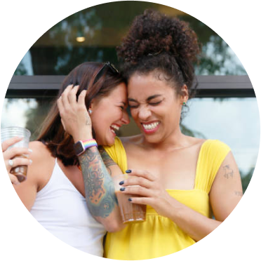
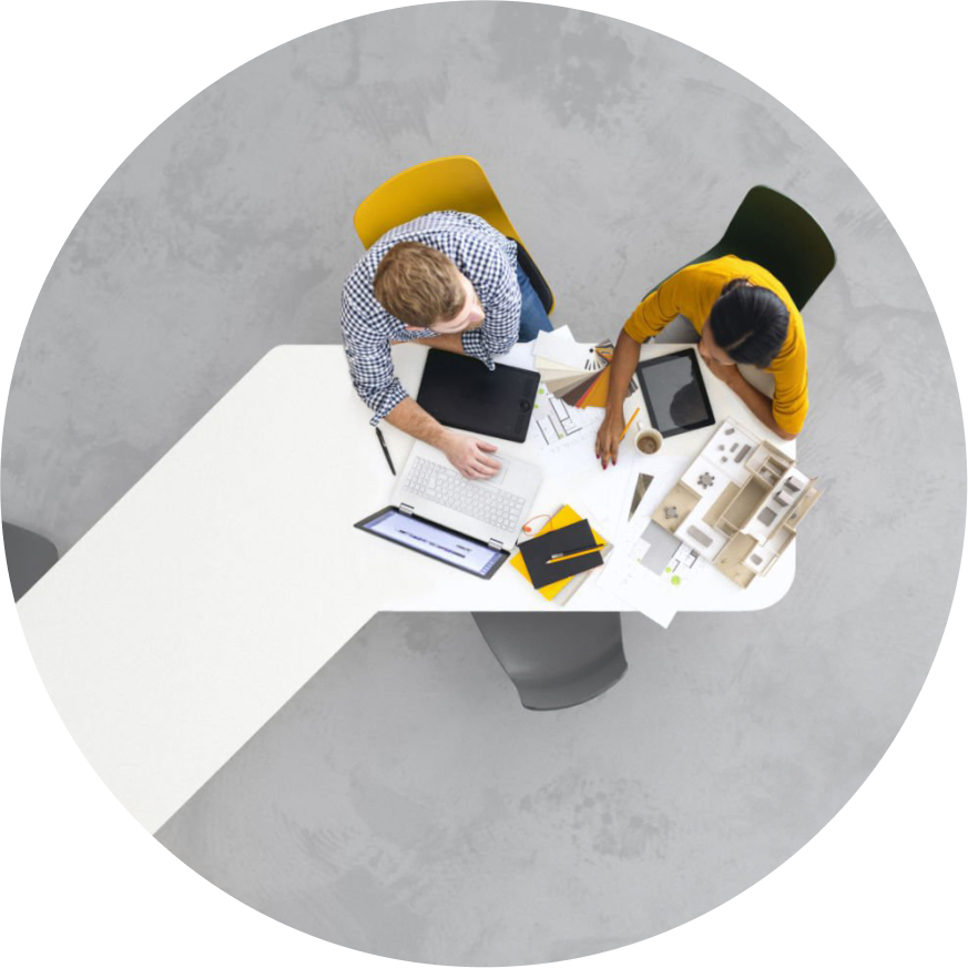
Our visuals revolve around a human-centric approach, emphasizing connections and celebrating the diversity within humanity. This ensures our designs authentically represent the myriad of human experiences and perspectives.
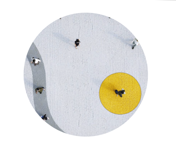
Our visuals play with the balance between light and darkness. This contrast enhances the authenticity and depth of our designs, moving away from generic imagery to create dynamic and engaging illustrations and photographs.
Create Contrast
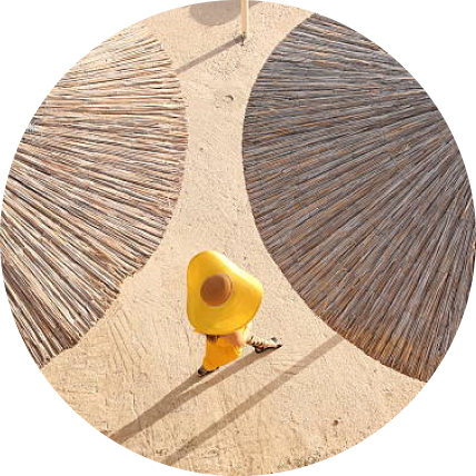
Present
Positivity
Our visuals exude a bright and positive outlook, reflecting our mission to inspire positive change. By framing information in an optimistic manner, we hope to encourage a similarly hopeful approach to life.
Convey Sophistication
Our designs convey sophistication, blending elegance with subtlety to create a polished brand image. This refined style not only elevates our visuals but also emphasizes trustworthiness, instilling confidence in our audience.
Express Simply
Our design philosophy champions simplicity and clarity. Sometimes, the mere outline of an element suffices—reflecting our belief that less can often be more—provided it’s done with finesse.
Accentuate Copy
Words remain at the heart of our visuals. We place them front and center, utilizing them to deliver powerful messages and anchor our visual narratives.
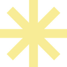
Bricon Inspiration
Draw inspiration from our logo, which encapsulates our brand’s visual language. Our designs also emphasize depth, layering elements to reveal the multifaceted richness of our ideas.